
A home for the easier-than-ever finances
A design case study of simplifying transactions to +8 million users
Liked it? Share this case study to inspire other designers

A design case study of simplifying transactions to +8 million users
Disclaimer
Before we dive in, I want to note that, in compliance with my non-disclosure agreement, I’ve omitted any confidential information from this case study. The insights shared here are my own and don’t necessarily represent the views of N26.
Getting started
N26 is a fee-free bank account you can open in under eight minutes, straight from your phone or computer. You can add money via cash or transfers from other accounts, set savings goals with Spaces, track your subscriptions, recurring payments, and spending habits with Statistics, or send and receive instant money from friends using MoneyBeam.
By 2021, N26 had surpassed 7 million customers across 25 markets, with a team of over 1,500 employees spread across Berlin, New York, Barcelona, Vienna, and São Paulo.
Context
For a global product used by millions of users, N26 app home screen plays a crucial role in setting the starting point for most financial journeys.
That’s why it’s so important to address challenges like helping users feel in control of their finances, analyzing spending habits, and staying informed about last-minute or urgent tasks. However, in a world filled with apps competing for users’ attention, finding a meaningful place in their daily routine has become increasingly difficult.
To put this into perspective, a study from the Technical University of Denmark revealed that our collective global attention span is shrinking due to the sheer volume of information presented to us. People now have more things fighting for their focus and tend to spend less time on each.
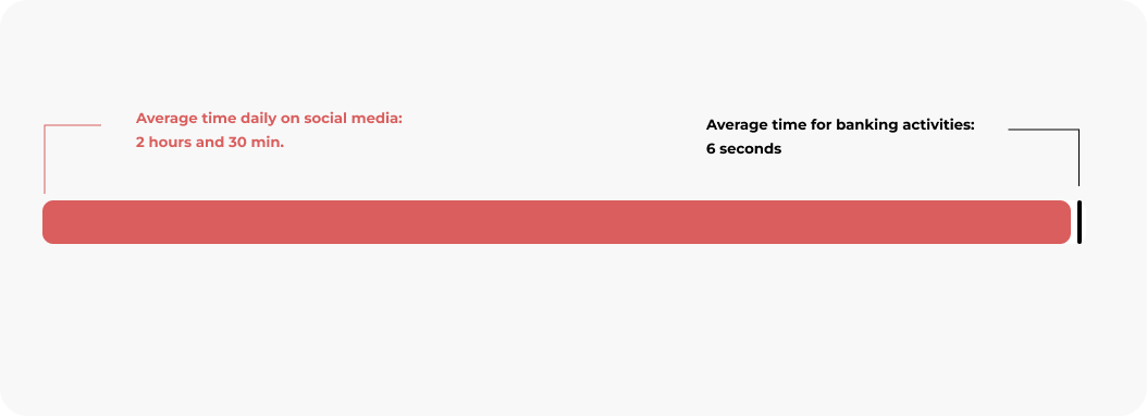
This means the time users dedicate to understanding a specific screen or product has dropped significantly. On top of that, another study by Statista highlighted a stark contrast: while users spend an average of 2 hours and 30 minutes daily on social media, the average time for banking activities is just six seconds—yes, six seconds.
Digging deeper into users’ financial concerns and general questions about banking, we at N26 surveyed over 10,000 individuals across the U.S. and Europe. The findings were eye-opening.
We discovered back then that money issues are among people’s biggest worries, with nearly 75% of Americans describing their feelings about finances using negative words like “worried” or “anxious.” And while money is a major concern, it’s often a topic we avoid discussing.
Our survey also showed that 39% of North Americans feel irritated or annoyed with their bank or banking service provider, and 25% of those said it’s because everything feels unnecessarily complicated.
Managing money can feel overwhelming, largely due to the abundance of complex terms and intimidating disclosures that often discourage people from tackling their finances head-on.
The challenge
That being said, being able to rapidly track your spendings and take action in case something is unclear has become a task to be done in seconds and, consequently, requiring as little cognitive load as possible.
Relevant information should be put right at a glance, fast to scan, and easy to understand. That’s why, when we talk about bringing N26 App Home Screen to the next level, we talk about two high-level goals:
My Role
When I joined the N26 design team in 2019, I led the design workstream of the app home screen until 2020. My cross-team was formed by amazing and talented people, including Lea Christodoulatos and Kristina Walcker-Mayer as Product Managers, Radina Doneva as User Researcher, Veronica Emelianova as Software Quality Engineer, Chirag Kunder as Android Engineer, Cédric Rolland as iOS Engineer, Demi Frechette as Software Engineer, and Larisa Amariei and Folger Fonseca as Tech Leads.
As a cross-functional team, we drew a plan to unpack and tackle problems from a user and business perspective, going through an extensive mapping over clashing moments in the user journey, analyzing customer support requests to understand why a substantial part of our 7 million customers reachs out to N26 so often, getting back to former research to find existing insights, and benchmarking patterns used by competitors and similar products.
In this case study, I’ll show some of these steps and go over the insights that guided us from discovery to delivery.
Business
Customer support is one of the biggest touchpoints between users and our product. When something is unclear or seems to be fraudulent, the first thing coming to users’ minds is to drop a message to CS to figure out if something is wrong.
This message gets into a stack of requests, and once someone from the support opens the case, the back and forth of messages begins. The friction and time spent can easily take days and trigger users’ anxiety and frustration. From a business perspective, this exchange of messages doesn't only hurt N26 as brand but can easily escalate to dozens of millions of Euros every year.
That’s why, from a discovery perspective, one of the key first step I took in partnership with Product was to map where the most frequent and repeated customer support requests were coming from.
The aim behind this analysis was, first, to group and size the amount of questions, concerns and requests and dovetail them to the features available at home screen.
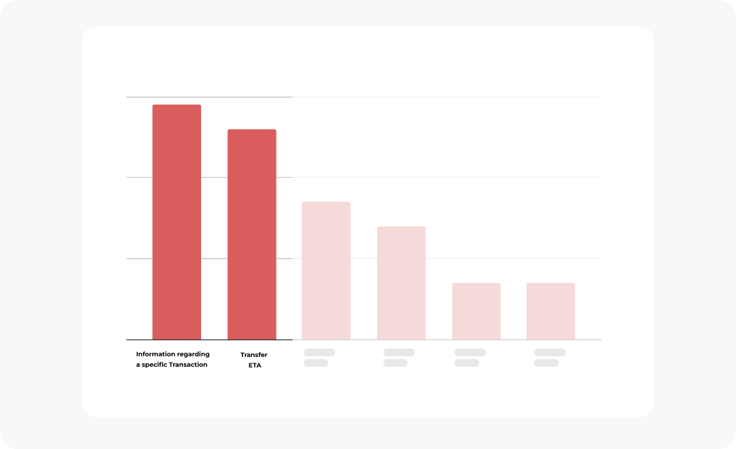
By grouping requests from November of that year, our analysis found that a significant share of questions clustered around two main topics.
The first focused on follow-up information about specific transactions—mainly because (A) users didn’t recognize an entry as a transaction and wanted to confirm whether it had actually taken place, (B) they didn’t fully understand why a certain amount was put on hold on their balance, or (C) they wanted to understand why a transaction had been declined.
The second major source of requests centered on understanding transaction status—specifically whether (A) a transaction had gone through, and if so, (B) how long it would take for the recipient to receive it.
Additional topics related to the home screen also emerged, shown as greyed out on the chart. At a later stage, these insights were used to help prioritize changes and improvements aimed at reducing other user requests. There were also other topics related to the home screen – indicated as greyed out on the chart – In a further moment, these insights would be used to prioritize changes and improvements to mitigate other users’ requests.
A summary of the top user stories – addressing A, B, C from the First topic and A and B, from the second – was put together by the brilliant product manager Lea Christodoulatos. This became the foundation for identifying pain points from both sides and uncovering new opportunities.
User Interviews
After gathering insights from customer support, mapping competitors’ patterns, and a couple of brainstormings, we faced the need to get users’ perspectives on the sparking opportunities raised as outcomes from our investigation.
To do so, we bucked ideas and questions and, in collaboration with our User Researcher Radina Doneva, we came up with a full-day workshop, with interviews and activities.
The session got started with a warm-up to grasp users’ relationships and experience with N26 – payment behaviors, usage of N26 features, reasons for logging in, most typical transactions, and which problems they have experienced so far.
Then, a card sorting activity containing specific actions, features, or content was performed in order to let them layer out which piece of content should live on the home screen and which should be deprioritized to a second step. As a follow-up activity, users were prompt to group these cards into “must-have”, “delightful”, and “not important” buckets.

As the final exercise, participants were presented with a prototype containing other features. Right after, we performed a memory recall test asking them to draw on an empty template what they had remembered from the prototype they interacted with a minute ago. The idea behind this was to do an explorative evaluation of user preferences and comprehension, and which info stood out and was kept in their minds.
At the end of the day, we spoke to ten financially active users who had N26 as the primary account, and their level of engagement varied from extremely disengaged to completely aware of their financial goals. Although users were mostly based in Berlin, we made sure to invite people from different nationalities with backgrounds varying from Student, to Lieferando Rider, Magazine Writer, and Social Media Media Marketing.
It’s part of users’ mental model to tap to see details when they don’t recognize a specific transaction. Meaning that the transaction details would be a good and reachable spot to allocate not only guidance and explanation regarding our product but detailed information regarding a purchase such as a merchant official legal entity, exchange rates, sender and recipient details, tags.
“If I have a charge that I’m not familiar with, I quickly tap into the transaction to understand them better, especially if I’m unsure or need more information, most often for ATM withdrawals.” Participant 2, 25 years, France.
All participants preferred seeing clean merchant details instead of a category icon or an encrypted name. The new version – presented in a prototype – was perceived as more modern, young, intuitive.
“This looks really good – way cleaner and more dynamic. We associate things a lot with brands and also I’m a visual person. It’s good to see the logos because it is easily recognizable, it’s faster for me to see what’s the payment“. Participant 7, 34 years, Berlin.
All participants preferred seeing clean merchant details instead of a category icon or an encrypted name. The new version – presented in a prototype – was perceived as more modern, young, intuitive.
More details, the better. Users tended to appreciate when more details regarding a specific transaction were presented such as recurrent labels, online, pending status, and even the location where the transaction was performed. In the card sorting exercise, these pieces of information were also usually placed in the delightful or essential buckets.“If the transaction is in a place that’s not where I live, it definitely needs to be there.”
Based on these insights collected from our users, business and tech perspective, I had a couple of session with my Product Manager and other team members so we can map different solutions to solve the issues we’ve found during our discovery.


Competitors
We tend to underestimate the importance of reducing the learning curve when users experience products for the first time.
However, creating familiarity can be helpful to make users ready when they experience our product for the first time. Knowing where to find key actions, using standardized gestures, and structuring content in a way that is familiar to consume gives them the feeling of control and safety to navigate with confidence and manage issues by themselves.
Bring this to our day-to-day life, it’s a similar experience when we do groceries in the same supermarket every Sunday.
We know where products are placed, how to reach out to someone to get help, where to pay and where’s the way out. On the other hand, when we visit a store for the first time, it’s quite common to feel disorientated until we understand how the system works.
This analogy can be reflected in the design and product development cycle. That’s why our next step was to have a look at big players and OS guidelines to understand the patterns already used out there.

Collaborating with my Product Manager, we benchmarked big competitors such as Revolut, Nubank, Apple Card, and Klarna amongst another couple of banking apps and similar products to get how they layer out information and structure their home page.
As presented on the chart below, we measured how frequently given information was presented and how prominent this info was displayed. The matrix between frequency vs. prominence revealed that details from the party responsible for taking money out of users’ accounts – whether a person, merchant – were somehow highlighted in the UI.

Apart from that, we were able to spot that any information responsible to give users more details regarding a specific transaction – i.e. location, exchange rate, date, tags, transaction category – was lifted up. The assumption lied on the fact, that these cues could lower the sensation that this transaction was fraudulent and foster the feeling of safety.
The solution
Based on the insights gathered in the Analogous Research, Customer Support Request and former research, two core opportunities emerged.
By redesigning it from the ground up, we’ve brought what’s relevant – merchant, geolocation, date, real-time status, and personalized actions at a glance. Everything is a one-tap way.
With the smart-actions prediction, only relevant actions were displayed on transaction details.

With geolocalization, the place and time where users made a purchase were lifted up so they can relax during their travels.

Informative banners and badges were placed to let users know the status and how long it would take for a transaction to get through.

By getting a transaction declined, now users get a quick message explaining why and how they can revert it.
Replacing encrypted names and random icons for merchant logos and clean names, we’ve brought clarity and made users’ transaction list easy to scan without looking twice.

By introducing gestures on users’ transaction lists, we brought the simplicity of the app messages to users’ banking experience. Got your salary in? Swipe to move it to a Space. Paid something? Swipe to top it up from your saving account.


To keep the experience cohesive cross-platforms, we aligned the main navigation on android and iOS.

Foreign transactions are now displayed with the original amount below.
Learnings
People are sensitive when their money is on the table, that’s why changing transactions can be challenging. Every improvement, instead of reducing the customer support requests, could easily lead to the opposite outcome, For instance, geolocating a transaction in a different city or simply showing a different logo might have triggered a massive backfire on social media. That’s why working closely with customer support played a terrific role for us to succeed.
Transactions are connected with hundreds of microservices and old legacy that could easily have taken weeks to understand the logic and be able to act, even after the extensive investigation from our front and back-end developers. That’s why one of the biggest learnings was the ability to quickly act and replan in case we face a wall. I lost count of how many times our team had to brainstorm to get out of a rabbit hole and move forward.
Learning how to design systematically was also part of my growing path in this project. First, because introducing new features doesn’t mean simply adding a line or an icon to the UI, that’s why the tough question of “What’s more important than what” helped us to prioritize what was relevant for users in a specific context and define logics behind even before the UI was thought out.Second, reusing or improving components from the N26 Design System – already tested, accessible or flexible – played a huge role.
It could have been easier from a single designer point of view to have introduced new components in our changes, but from a perspective system serving a global product, using the existing components helped us not only improve our feature but the product as a whole.Third, the N26 App home page is rather an ecosystem than a screen. Transactions must live with notifications, balance, info cards, status, overdraft, search, and at least a dozen other components important in the user journey.
it was also interesting to see motivations, how many contexts and use cases triggered users to open N26 apps and check their transactions. On that matter, it was also interesting to understand that the journey for some people didn’t even start on the Home page, rather using Apple Pay or the physical card to pay, get a notification stating that is all good and that’s it, without even opening the app.
This project involved so many people that I couldn’t leave it without mentioning learning how crucial was to hear different voices – internal and external -, experiences and feedback. Users were quite vocal during the releases and willing to give feedback. That was reflected in the hundreds of mentions on social media regarding our changes — sometimes positive, sometimes negative, but always constructive and helping us to push the product forward.

Thanks
A huge thanks to everyone involved in the process from getting to go.In particular, I’d like to thank Lea Christodoulatos, Kristina Walcker-Mayer, Radina Doneva, David Quiring, Christian Herzlein, Jude Temianka, Tishia Que, Julian Kraan, Emanuel Miličević, Fatma Köstekli, Francesco Bianchi, Vivian Lo, Bruce Lui, Veronica Emelianova, Chirag Kunder, Cédric Rolland, Demi Frechette, Larisa Amariei and Folger Fonseca.

Get a 30-minute call to go through portfolio reviews, interview preparation, career growth, and much more.